Here are 50 terms to help you understand graphic design better!
Alignment/Justification
Alignmentrefers to the lines that text or a graphic is set to sit along.
Justifiedrefers to when text or other elements are aligned to both boundaries.
Drawings: Samantha Pires/My Modern Met
Analogous
Analogous colorsare a trio of colors that are close to each other on thecolor wheel.
For example: the trio of violet, cyan, and blue would be considered analogous colors.
Ascender/Descender
Ascenderanddescenderare terms used to describe specific elements of letters.
Drawings: Samantha Pires/My Modern Met
We first need to understand that the x-height of a letter is the height of a lowercase letter x.
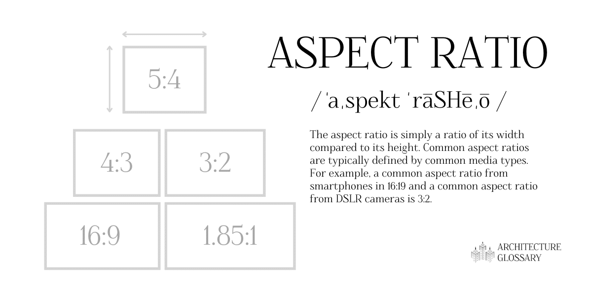
Aspect ratios are typically defined by common media types.
Bleed
Bleedis an important idea to consider for printed works.
Drawings: Samantha Pires/My Modern Met
This color system is similar to another term on this list, RGB.
Like RGB, combining these colors in different amounts creates a wide range of colors.
Color Theory
Color theoryinvolves ideas about the best uses of color.

Drawings: Samantha Pires/My Modern Met
Complementary
Complementary colorsare often calledopposite colorsbecause of their stark contrast.
If complementary colors are added together they produce something between white and black.
For example: red and green are complementary colors.
Drawings: Samantha Pires/My Modern Met
Composition
Compositionis a general but important term to understand about graphic design.
It refers to the general arrangement and text, images, and graphic elements on a work.
Good composition often includes other general graphic design terms includingbalanceandhierarchy.
Drawings: Samantha Pires/My Modern Met
Contrast
Contrastessentially refers to the difference between colors or difference between elements.
Contrast is a useful design tool to add variation, visual interest, and hierarchy into a design.
Debossing/Embossing
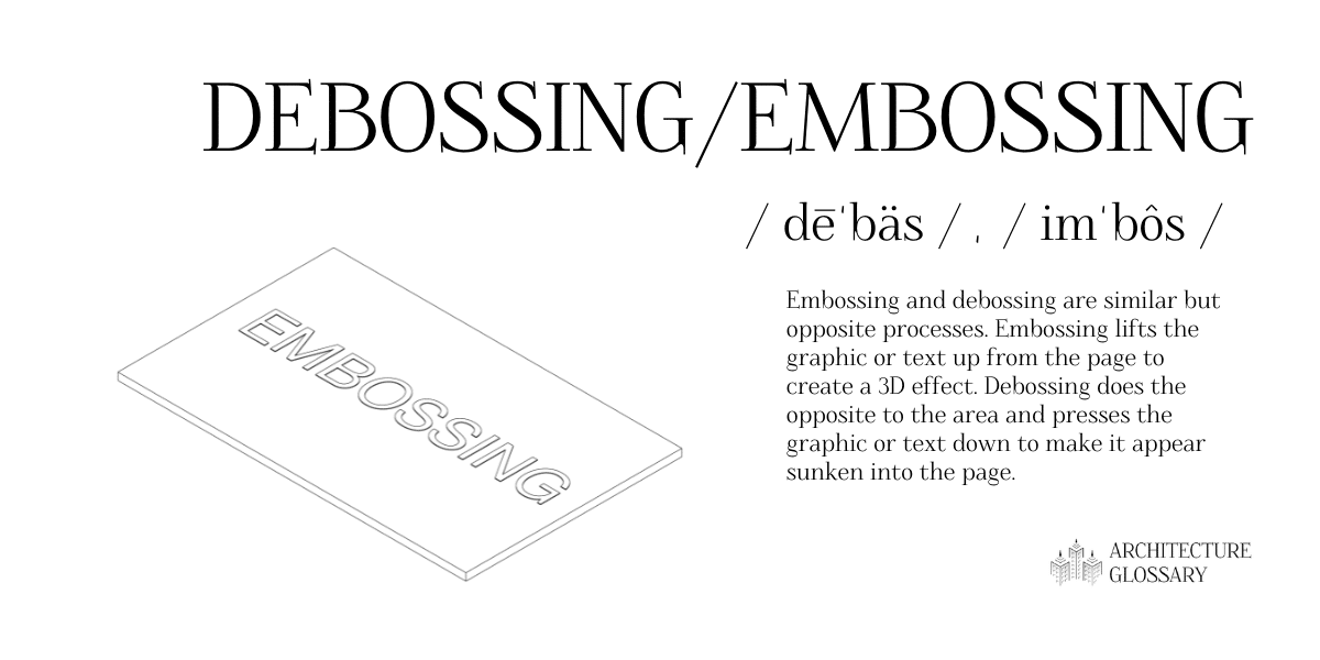
Embossinganddebossingare similar but opposite processes.
Drawings: Samantha Pires/My Modern Met
Embossing lifts the graphic or text up from the page to create a 3D effect.
The higher this number is, the better the resolution of the work.
Foiling
Foilingis a design style used on printed work.
Drawings: Samantha Pires/My Modern Met
It involves using a thin metal foil that is pressed on paper to give a shiny appearance.
It is possible to use a variety of metals and color.
Font
Fontrefers to the variations possible with atypeface.
The tern font is often confused with the termtypeface, which is also defined on this list.
Golden Ratio
Thegolden ratiois a mathematical ratio found in nature that heavily influenced design.
Using the golden ratio in art and design help to create a well-balanced work that feels effortlessly natural.
One simplified idea of the golden ratio is theRule of Thirdsand it is also defined on this list.
Gradient
Agradientis when one color gradually transitions into another color.
A gradient can include any two colors or can include more than two.
Grid
Agridis a critical system of organization that defines a design.
Most organized design follows some punch in of grid.
Grids are often made up of perpendicular lines but can be made of curvy or parametric guidelines as well.
It may be difficult to achieve the desired visual balance without using a grid as structure.
Hex Code
Hex codesare a method of defining specific colors.
These six-digit codes are used in many formats including HTML and CSS.
They are also related to another term on this list,RGB.
It is a very important element to consider in a project because it has serious implications for compositions.
Successful hierarchy allows users to immediately take away important pieces of information.
Hue
Simply put, ahueis a pure color.
Tertiary colors are not hues because they are created by mixing colors that are not primary.
Other terms related to hue on this list includeshade,tint, andtone.
Many of these other terms are created by adding something to a hue.
Leading
Leadingis a typography term that refers to the vertical space between two lines of text.
Lorem Ipsum
Lorem Ipsumis a very popular form of placeholder or filler text.
It is the standard placeholder text that signifies where writing will be but has not yet been finalized.
You might find lorem ipsum used in amock-up, another term on this list.
Margin
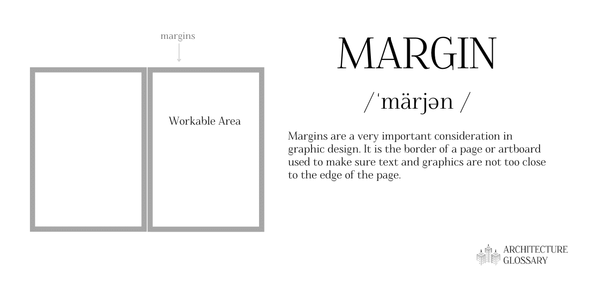
Marginsare a very important consideration in graphic design.
Mock-up
Amock-upis a draft of a design or work that helps others to understand it.
Mock-ups can be printed or digital.
Monochrome design can be anything made from a single color.
Mood boards often includepalettes, another term on this list.
Opacity
Opacityrefers to the transparency of an image or an object in graphic design.
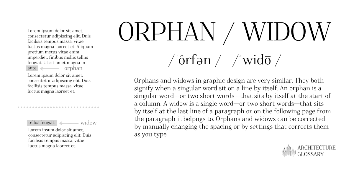
Orphan/Widow
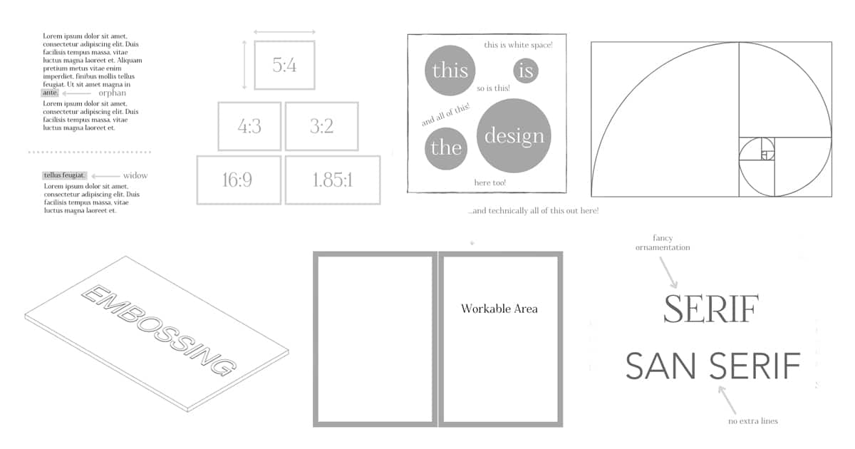
Orphansandwidowsin graphic design are very similar.
They both signify when a singular word sits on a line by itself.
An orphan is a singular wordor two short wordsthat sits by itself at the start of a column.
A widow is a single wordor two short wordsthat sits by itself at the last line of a paragraph.
Overprint
Overprintingis an interesting technique where colors are printed over each other to create a layered effect.
For example, when magenta is printed over yellow, it results in a red color.
Palette
Palettesare an important part of any design.
Raster
Raster graphicsare made up of pixels.
They are the opposite ofvectorswhich are made up of shapes, lines, curves, and other computer-made elements.
Resolution
Resolutionis the quality of an image.
High resolution images are higher quality and low resolution images are lower quality.
The latter will appear pixelated or unclear.
When combined, the three colors are capable of creating many colors.
RGB colors include a code for each of the three colors from 0 to 255.
Rule of Thirds
Therule of thirdsis essentially a simplification of the golden ratio.
To follow the rule of thirds, divide the work into thirds horizontally and into thirds vertically.
The subject or subjects of the work should be centered along these lines.
Saturation
Saturationis a general term used to describe colors.
Saturation describes how intense and vibrant a hue is.
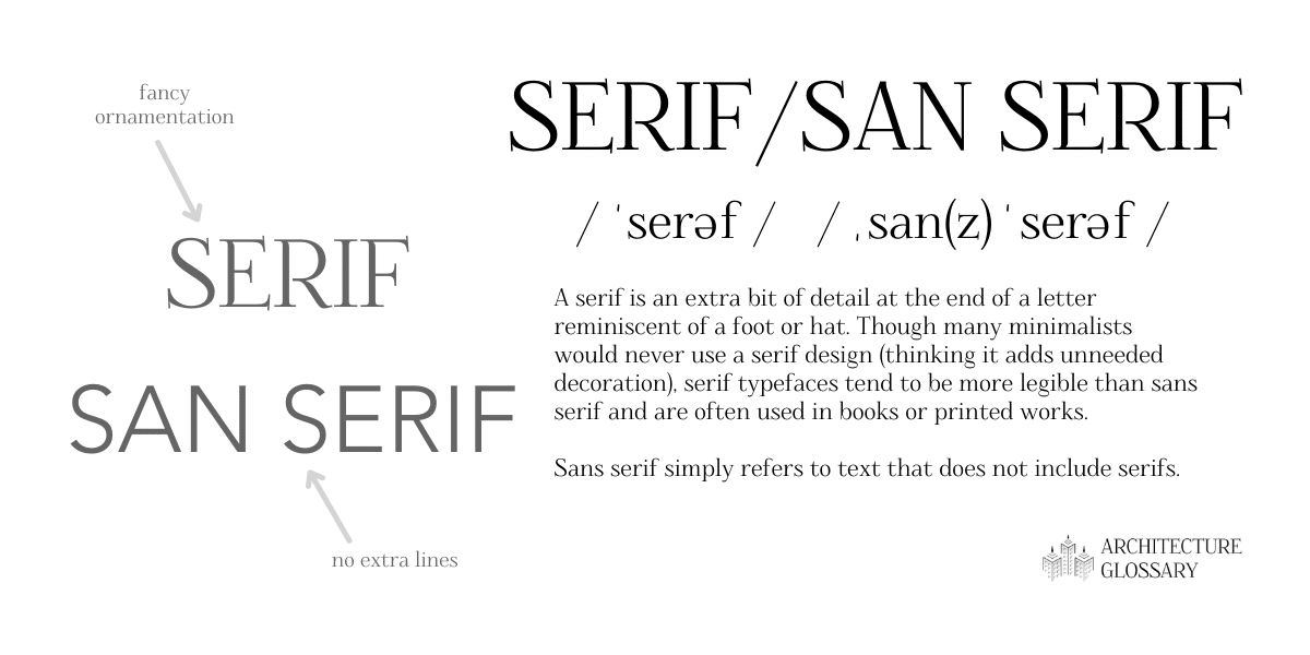
Sans serifsimply refers to text that does not include serifs.
Style guides ensure consistency across a set of works.
For example, NASA has aGraphics Standards Manualthat simplifies all official documents and graphic projects.
Swatch
In digital design, aswatchis a digital palette of colors and textures.
It is useful to keep track of the elements used in a work.
For example: the trio of red, cyan, and green would be considered triadic colors.
Typeface
Typefacerefers to a throw in design and includes all variations of that design.
For example, Times New Roman is a famous typeface.
The term typeface is often confused with the termfont, which is also defined on this list.
Typography
Typographyis another art form distinct from the more general graphic design.
Vector
Vector graphicsare made up of shapes, lines, curves, and other computer-made elements.
Weight
Weightis a term related to typography.
It is the thickness of each letter of character in relation to the letter or characters height.
A particular typeface may come in a variety of weights including light, book, bold, and more.
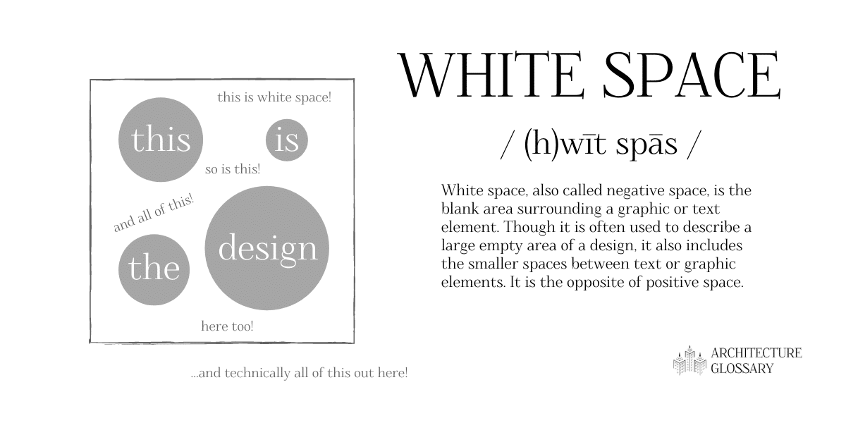
It is the opposite of positive space.
X-height
Forx-height, the definition is pretty much right there in the name.
For any font, the x-height refers to the height of the lowercase letter x.